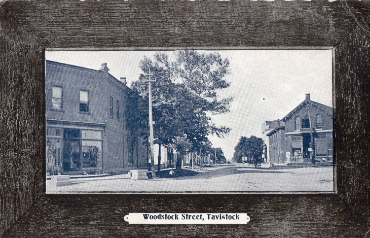
One of the early publishers of Tavistock postcards was Stedman Brothers, Ltd. who produced postcards between 1908-1915.
The Stedman’s Bookstore was established in 1904 in Brantford by father Samuel and two sons. The Stedman brothers went on to create a chain of five-and-10-cent department stores across Canada, mostly in small towns. Many of their cards are of locations where they operated a store. Their headquarters was in Brantford, but they had a branch in Toronto, and later in Winnipeg.
Stedman’s produced both half-tone cards and collotype cards. If, as a retailer, you wanted just a smaller quantity of postcards and ones that were a little cheaper, you could order a half-tone card rather than a collotype. We know something about the business side of the industry because a lot of “publisher’s sample” postcards are still around. Sometimes, a sample card would include pricing. One of the problems with selling printed postcards was that you had to order a lot of them to make a print run economical.
This frame-view tinted postcard made by Stedman's would have a relatively limited (short-lived and/or merely local) appeal. The price of 1,000 Stedman frame-views was $5.50 and you could also order just 500 if that was all you wanted (albeit at a higher per-card price). The quoted prices for collotype images would be higher. For someone who couldn’t really hope to sell more than a few hundred of a given postcard, the Stedman frame-view might indeed have seemed “a good proposition”. The images would usually be tinted, most often blue. While not spectacular, the result was not without aesthetic appeal.
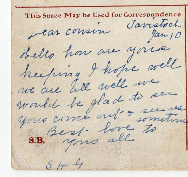
In the "Golden Age of Postcards", between 1903 and 1905, a new style of writing emerged which you no doubt will be familiar with. It is called Postcardese. It was the style of writing used on postcards: messages were written in short sentences and jumped quickly from one topic to another.