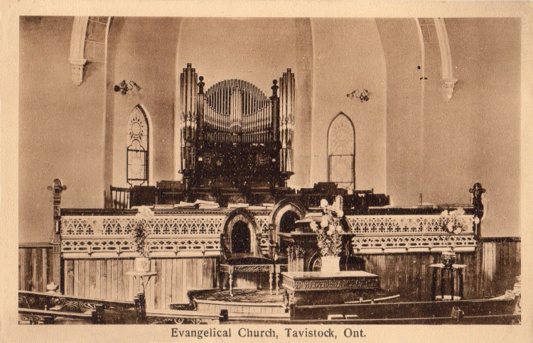
This postcard was published by the Pugh Manufacturing Company of Toronto. It is numbered T O 610 7127. It is from around 1909. The manager of Pugh Manufacturing Co. was Thomas James Pugh. The first Pugh postcards may have appeared in 1907 although that is far from certain. As with many “Golden Age” postcard publishers, Pugh’s production had largely ceased by around 1912.
Early postcards were often sepia toned to make them look like real albumen print photographs. About 85 percent of all photographs made in the 19th century were albumen prints. Photographs made with albumen have a sour yellow look. Because of that colour, albumen prints were almost always toned to improve their appearance. Gold toning created a red to purple brown cast or a blue black. Platinum toning created a brown look. When double toned with gold and platinum the print would remain neutral. The paper itself was often dyed pink though blue, green, and violet were also common. Albumen photographs were so familiar to the public eye that albumen became synonymous with photography and early postcards were tinted to give them the same authentic photograph look.
